
Why CTA Button Colors and Placement Matter More Than You Think
Your call to action button is the single most important element on any landing page, homepage, or service page. It is the gateway between a visitor browsing your site and a visitor becoming a lead or customer. Yet many business owners and designers choose CTA button colors based on personal preference rather than data and psychology.
In this guide, we break down which call to action button colors perform best, why contrast matters more than any single color, and exactly where to place your CTA buttons on a page for maximum clicks. Everything here is backed by conversion research, design psychology, and practical examples you can apply right away.
The #1 Rule: Contrast Beats Any Specific Color
Before we talk about orange vs. green vs. red, you need to understand the most important principle behind high-converting CTA buttons:
Contrast is king.
A button that blends into its background will always underperform, no matter what color it is. A CTA must visually “pop” from everything around it. This means the best color for your CTA depends entirely on your page’s existing color scheme.
Here is a simple way to think about it:
- If your site background is white with blue accents, an orange or green CTA will stand out.
- If your site uses warm tones like orange and yellow, a blue or dark green button creates contrast.
- If your page is dark or black, a bright color like orange, red, or vivid green will grab attention instantly.
Neil Patel and other conversion experts consistently emphasize this: do not assume one universal color will increase your conversions. Always choose the color that creates the highest visual contrast against your page design.
Top Performing CTA Button Colors (Based on Data)
A well-known study by Ed Leake analyzed 90 high-converting CTA buttons across multiple industries. The results showed clear patterns in which colors appear most often among top performers.
| Color | Psychology | Best Used When |
|---|---|---|
| Orange | Enthusiasm, urgency, warmth | E-commerce, SaaS free trials, lead generation forms |
| Green | Trust, safety, “go” signal | Checkout pages, health/finance sites, sign-up forms |
| Red | Urgency, excitement, importance | Limited-time offers, clearance sales, high-urgency CTAs |
| Blue | Trust, reliability, professionalism | B2B services, financial products, corporate sites |
| Yellow/Gold | Optimism, attention, caution | Attention-grabbing secondary CTAs, warning-related actions |
Key takeaway: Orange, blue, red, and green are the four most commonly used colors among high-converting CTAs. But the winner on your specific site will always be the one that contrasts best with your design.
Orange: The Conversion Favorite
Orange consistently shows up as a top performer across industries. It sparks enthusiasm and a sense of action without the aggressive connotations of red. If your website uses a cool-toned palette (blues, grays, whites), an orange CTA is almost always a safe and effective choice.
Green: The Trust Builder
Green is especially effective on sites selling consumer electronics, health products, or financial services. An Amasty study found that green was the most effective button color on consumer electronics sites, converting at 21%. It signals “go” and creates a feeling of safety.
Red: Handle With Care
Red drives urgency and grabs attention immediately. It works well for flash sales, limited offers, and situations where you want the visitor to act fast. However, red can also signal “stop” or “danger” in certain contexts, so always A/B test red buttons against alternatives.
Blue: The Professional Standard
Blue conveys trust and reliability. It is the dominant color across major tech platforms (Facebook, LinkedIn, PayPal) for a reason. On B2B and corporate service pages, blue CTAs often perform well because they align with the professional tone visitors expect.
Color Psychology Principles to Guide Your CTA Choices
Beyond the specific colors listed above, these design psychology principles will help you make smarter decisions:
- The Isolation Effect (Von Restorff Effect): An element that is visually different from its surroundings is more likely to be remembered and clicked. Your CTA button should be a color that appears nowhere else (or very rarely) on the page.
- Visual Hierarchy: The CTA should be the most visually dominant element in its section. Use color, size, and whitespace to make it impossible to miss.
- Emotional Alignment: Match your button color to the emotional tone of the action. Buying a security product? Green or blue feels right. Grabbing a limited deal? Red or orange creates urgency.
- Accessibility: Ensure your button color has enough contrast against its text color. Use a contrast checker tool to verify it meets WCAG AA standards (minimum 4.5:1 contrast ratio for text).
CTA Button Placement: Where to Put Your Buttons for Maximum Clicks
Color gets the attention, but placement determines whether visitors actually see and click your button. Here are the most effective placement strategies based on page type.
Above the Fold (Always)
Your primary CTA should always appear above the fold, meaning visitors see it without scrolling. This is non-negotiable on landing pages, homepages, and service pages. Studies consistently show that the first screenful of content receives the most attention.
Placement by Page Type
| Page Type | Recommended CTA Placement | Why It Works |
|---|---|---|
| Landing Page | Hero section (above the fold) + after key benefits + bottom of page | Catches early converters and those who need more information before deciding |
| Homepage | Hero banner + after social proof section + sticky header/bar | Guides visitors toward the primary action regardless of how far they scroll |
| Service Page | After service description + after pricing/features + at page bottom | Lets the visitor gather all relevant info before being asked to commit |
| Blog Post | Inline within the content + end of article + sidebar or floating bar | Catches readers at their highest engagement points |
| E-commerce Product Page | Next to product image/price (above the fold) + sticky “Add to Cart” on mobile | Reduces friction by keeping the buy action always accessible |
The Power of Repeating Your CTA
Do not rely on a single button. On longer pages, repeat your CTA at logical intervals:
- After presenting a key benefit or feature
- After testimonials or social proof
- After a pricing table or comparison
- At the very bottom of the page (for visitors who read everything)
Each repeated CTA gives visitors another chance to convert at the exact moment they feel convinced.
Sticky CTAs and Floating Bars
Sticky navigation bars or floating CTA buttons that remain visible as the user scrolls can significantly improve conversion rates, especially on mobile devices. Just make sure they do not obstruct content or create a frustrating user experience.
Practical Examples: Color + Placement Working Together
Example 1: SaaS Landing Page
A software company uses a clean white background with dark gray text. Their primary CTA is a bright orange “Start Free Trial” button placed in the hero section, repeated after the feature showcase, and again at the page bottom. The orange pops against the neutral palette, and the repetition ensures no visitor misses it.
Example 2: Local Service Business Homepage
A plumbing company website uses blue branding throughout the header and footer. Their CTA is a vivid green “Get a Free Quote” button positioned in the hero area and in a sticky bar at the top of the page. Green contrasts with the blue, signals trust, and stays visible at all times.
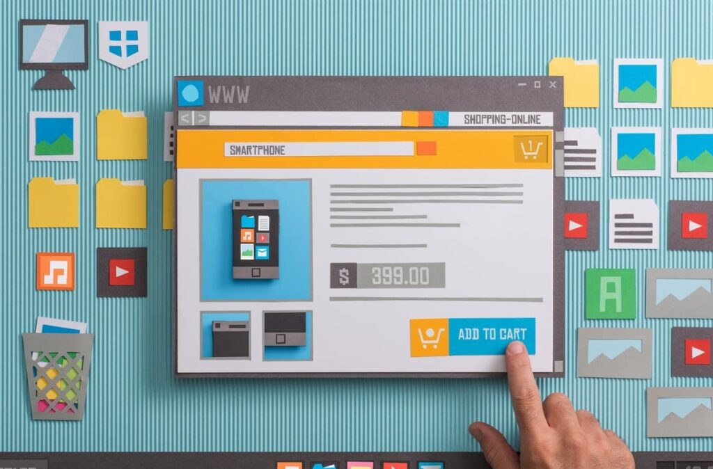
Example 3: E-commerce Product Page
An online electronics store has a minimal white layout. The “Add to Cart” button is large, green, and positioned directly next to the product price. On mobile, it becomes a sticky element at the bottom of the screen. The result: the action button is always one tap away.
8 Actionable Tips for Optimizing Your CTA Buttons
- Pick a high-contrast color that does not appear elsewhere on the page as a dominant element.
- Make the button big enough to be easily tapped on mobile (minimum 44×44 pixels as recommended by Apple’s Human Interface Guidelines).
- Use whitespace generously around the button so it breathes and draws the eye.
- Write action-oriented text on the button. Use phrases like “Get Started,” “Claim Your Spot,” or “Download Free Guide” instead of generic “Submit” or “Click Here.”
- Place the primary CTA above the fold and repeat it at logical decision points.
- Add a micro-copy line near the button to reduce anxiety (e.g., “No credit card required” or “Cancel anytime”).
- Use directional cues like arrows, images of people looking toward the button, or layout flow that naturally guides the eye to the CTA.
- A/B test relentlessly. Test one variable at a time (color, placement, size, text) to find your highest-converting combination.
Common CTA Mistakes to Avoid
- Too many competing CTAs: If every section has a different action (“Buy Now,” “Learn More,” “Subscribe,” “Contact Us”), visitors get overwhelmed. Prioritize one primary CTA per page.
- Low contrast buttons: A light blue button on a light blue background is invisible. Always check contrast.
- Hiding the CTA below the fold: If visitors have to scroll far to find your button, many will leave before they see it.
- Ghost buttons for primary actions: Outline-only (ghost) buttons look clean but often underperform solid, filled buttons for primary CTAs. Reserve ghost buttons for secondary actions.
- Ignoring mobile: Over half of web traffic comes from mobile devices. If your CTA is hard to tap or hidden on small screens, you are losing conversions.
How to A/B Test Your CTA Button Colors and Placement
The only way to know for certain what works best on your website is to test. Here is a simple process:
- Start with a hypothesis. For example: “Changing our CTA button from blue to orange will increase clicks because orange provides higher contrast on our page.”
- Use a testing tool. Google Optimize alternatives like VWO, Optimizely, or Convert are solid choices in 2026.
- Run one test at a time. Do not change the color AND the placement simultaneously, or you will not know which change caused the result.
- Wait for statistical significance. Do not call a winner after 50 clicks. Most tests need several hundred conversions to produce reliable data.
- Document and iterate. Record what worked, then test the next variable.
Quick Reference: CTA Color Selection Flowchart
Not sure which color to start with? Follow this simple decision path:
- Look at your website’s dominant colors (header, background, brand palette).
- Choose a CTA color that is not part of that dominant palette.
- Verify the contrast ratio between the button color and both the page background and the button text.
- If you are still unsure, start with orange or green. They work across the widest range of site designs.
- A/B test against one alternative color after two weeks of baseline data.
Frequently Asked Questions
What is the single best color for a call to action button?
There is no single universal best color. The most effective CTA color is the one that creates the strongest contrast against your page’s design. That said, orange, green, red, and blue are the most commonly seen colors among high-converting buttons across industries.
Does red scare people away from clicking?
Not necessarily. Red can create urgency and excitement, making it very effective for limited-time offers and sales. However, in contexts where trust and calm are more important (like financial services or healthcare), red may feel too aggressive. Always test.
Should I use the same CTA color across my entire website?
Yes, for consistency. Using the same color for all primary CTAs trains visitors to recognize your action buttons. This builds a visual pattern that speeds up decision-making and improves click rates across all pages.
Where should I place a CTA on a long-form landing page?
Place your CTA above the fold in the hero section, then repeat it after major content blocks such as benefit sections, testimonials, and pricing tables. Always include one final CTA at the bottom of the page for visitors who read everything before deciding.
Are ghost buttons (outline only) good for CTAs?
Ghost buttons are best used for secondary actions (like “Learn More” or “See Demo”). For your primary conversion action, a solid, filled button with a high-contrast color almost always outperforms a ghost button.
How big should a CTA button be?
On desktop, aim for a button that is large enough to be immediately noticeable but proportional to the surrounding design. On mobile, the minimum recommended tap target is 44×44 pixels. Bigger is generally better as long as the button does not overwhelm the page layout.
How long should I run an A/B test on CTA colors?
Run your test until you reach statistical significance, which typically requires at least a few hundred conversions per variation. For most small to mid-sized websites, this means running a test for two to four weeks. Never make decisions based on just a few days of data.