
If your homepage gets visitors but very few of them click, sign up, or buy, the problem is rarely your product. More often, it’s that people simply don’t know where to look. That’s where visual hierarchy in web design comes in.
This guide is written for business owners, marketers, and founders who want to audit their own homepage without needing a design degree. By the end, you’ll know exactly what to fix and why.
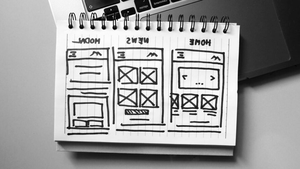
What Is Visual Hierarchy in Web Design?
Visual hierarchy is the order in which your eyes naturally process the elements on a web page. It’s the silent system designers use to tell visitors: “Look here first, then here, then here.”
Think of it like a newspaper front page. The biggest headline grabs you first, then the subheadline, then the photo, then the article body. Nobody has to explain the order, you just feel it. A well-designed homepage works the exact same way.
When visual hierarchy is missing, every element competes for attention. Visitors feel confused, bounce, and leave without taking action. When it’s done right, users glide through your page in the exact order you intended.
Why Visual Hierarchy Controls Where Users Look First
Humans don’t read web pages. They scan them. Studies from the Nielsen Norman Group show that visitors decide whether to stay on a site within a few seconds. During those seconds, their eyes follow predictable patterns based on:
- Size: bigger elements feel more important
- Color and contrast: bright or contrasting elements pop forward
- Spacing: isolated elements get more attention
- Position: top and left areas are seen first in Western reading cultures
- Typography: bold and heavy fonts signal priority
If you control these signals, you control the visitor’s journey. If you don’t, the page controls them, and rarely in your favor.
The 5 Tools You Can Use Right Now
1. Size
The biggest thing on the page wins. On a homepage, your main headline (the value proposition) should be the largest text on the screen. Your call-to-action button should be visibly larger than secondary links.
Quick audit: open your homepage and squint. What do you see first? If it’s not your main message or your main button, your sizing is off.
2. Color and Contrast
Color isn’t decoration, it’s direction. Reserve your boldest accent color for the one action you want people to take. If your “Buy Now” button is the same color as your social icons and your footer, you’re diluting the signal.
A good rule: one primary action color per screen. Everything else stays neutral.
3. Spacing (White Space)
Empty space isn’t wasted space. It’s a spotlight. The more breathing room around an element, the more important it feels. Cramming text and buttons together makes everything feel equally urgent, which means nothing feels urgent.
4. Position
Eye-tracking research shows users scan in F-shaped or Z-shaped patterns. Place your most important content along these natural paths: top-left logo, top-right navigation, large hero headline, then a clear CTA below.
5. Typography
Use only two or three font sizes on your homepage. A typical hierarchy looks like this:
| Element | Suggested Size | Weight |
|---|---|---|
| Hero headline | 48 to 72 px | Bold |
| Subheadline | 20 to 24 px | Regular |
| Body text | 16 to 18 px | Regular |
| Captions | 12 to 14 px | Light or Regular |
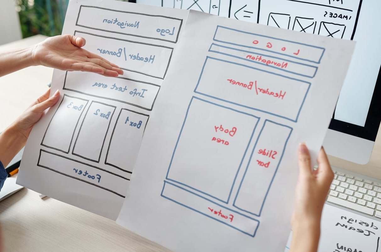
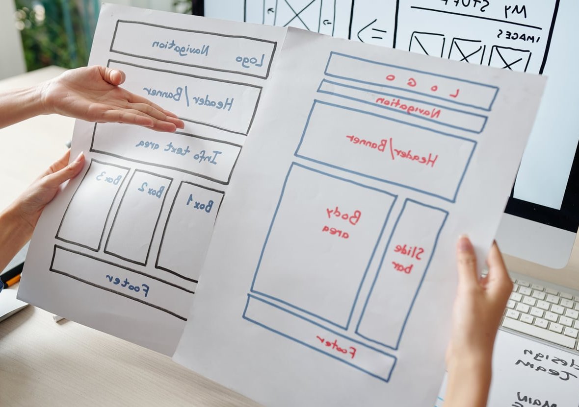
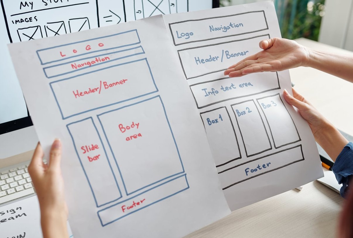
How to Apply Visual Hierarchy on Your Homepage (Step by Step)
- Define your one main goal. Is it a signup, a purchase, a demo request? Pick one.
- Write your value proposition headline. One sentence that tells visitors what you do and who it’s for.
- Make that headline the biggest text on the page.
- Add a clear, contrasting CTA button directly below or beside the headline.
- Use plenty of white space around the hero section. Don’t crowd it.
- Add supporting sections in descending order of importance: benefits, social proof, features, FAQ, secondary CTA.
- Limit colors and fonts. Two fonts and one accent color is usually enough.
- Test on mobile. Over half your visitors are likely there. Hierarchy must hold on small screens too.
A Real-World Example
Imagine two versions of the same SaaS homepage:
Version A: a busy hero with three buttons of equal size, four headlines, and a stock photo collage. Visitors don’t know where to click.
Version B: one large headline (“Send invoices in 30 seconds”), one subheadline, one bright orange “Start Free Trial” button, and a simple product screenshot. Everything else fades into the background.
Version B converts better every time, not because it’s prettier, but because it respects visual hierarchy.
Common Mistakes to Avoid
- Using multiple competing CTAs in the hero section
- Making every section title the same size as the main headline
- Filling every pixel with content (no white space)
- Using too many colors or font weights
- Hiding the main CTA below the fold
- Forgetting that mobile hierarchy is different from desktop
Quick Self-Audit Checklist
Open your homepage right now and answer honestly:
- Can a stranger understand what you offer in under 5 seconds?
- Is there one obvious next step (one main button)?
- Is your headline clearly the largest text?
- Does your CTA stand out by color?
- Is there enough breathing room around important elements?
- Does the same hierarchy hold on a phone?
If you answered “no” to any of these, you have an easy win waiting.

Final Thoughts
You don’t need to be a designer to apply visual hierarchy in web design. You just need to make deliberate choices about what visitors should see first, second, and third. Start with your homepage hero, fix the most obvious issues, and watch how the clarity translates into more clicks, signups, and sales.
FAQ
What is visual hierarchy in simple terms?
It’s the way design elements are arranged so visitors automatically know what to look at first, second, and third on a page.
What are the main principles of visual hierarchy?
Size, color and contrast, spacing, position, and typography. Used together, they guide the eye through your page in the order you choose.
How does visual hierarchy improve conversions?
By reducing confusion. When visitors instantly see your value proposition and a clear next step, they’re far more likely to take action instead of bouncing.
Do I need a designer to fix my homepage hierarchy?
Not always. Many issues can be fixed by resizing your headline, simplifying your color palette, removing extra buttons, and adding white space. A designer helps for polish, but the strategic choices are yours.
Is visual hierarchy different on mobile?
Yes. On mobile, content stacks vertically, so the order of elements matters even more. Always preview your homepage on a phone to make sure the hierarchy still works.